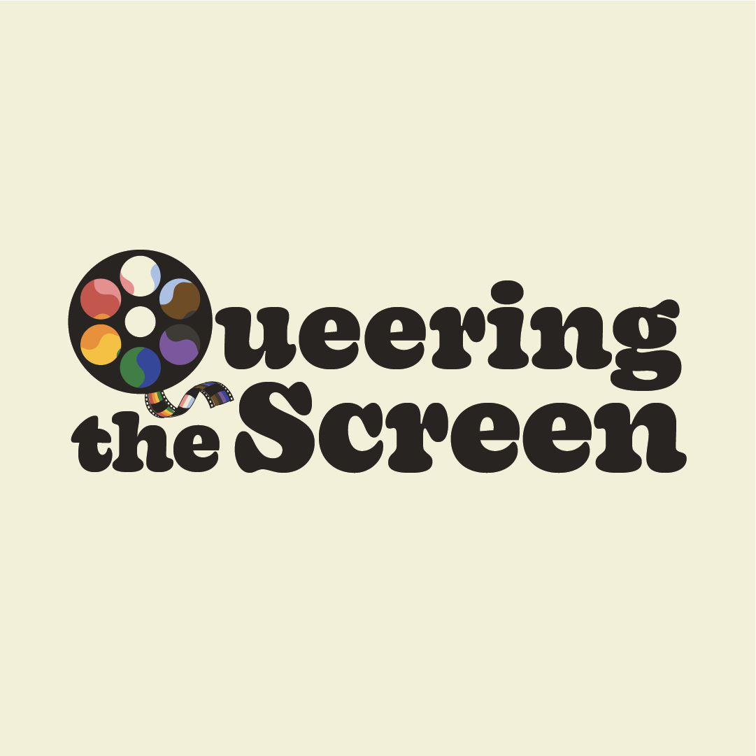
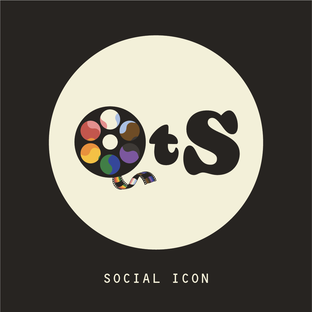
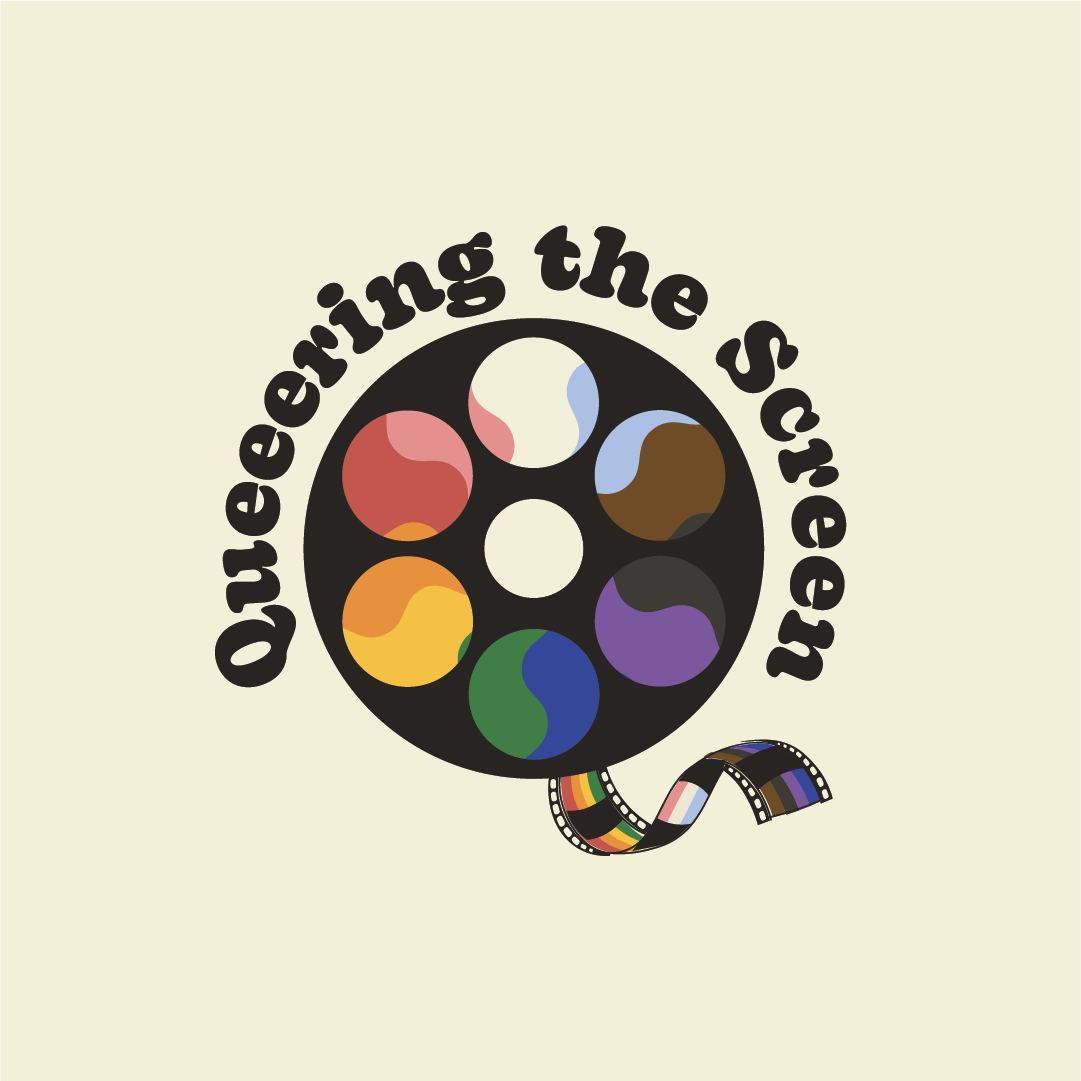
Logo design for Queering the Screen, a Toronto-based Queer advocacy group supporting LGBTQA2S+ members of the TV, film, and production industries. My client approached me with a beautiful concept of combining the colours of the Pride flag with a film reel icon to create a "Q" – absolutely genius!
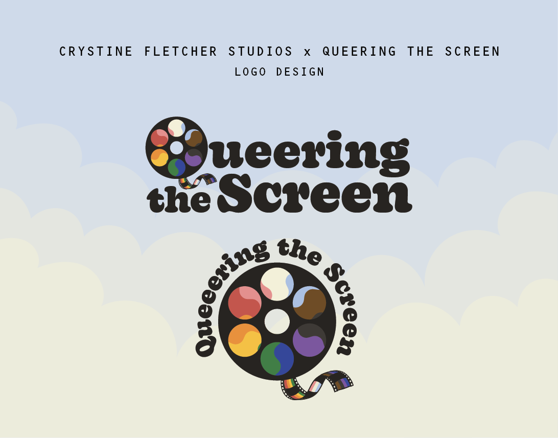
This particular design concept required quite a bit of mathematical problem solving – a 360 degree circle encompassing 6 equidistant windows showcasing the 11 colours of the pride required getting curled up with my calculator – and adding a swirling effect to the Pride flag allowed for more evenly distributed visibility for each colour.
Colourway experimentations: